All about the data
It's time to get geeky
Don’t get too excited - we haven’t got our node up and running yet #sadface. In the meantime we’ve been exploring different ways of visualising the data. Note that this post is quite technical!
Old school tools
Jupyter notebooks and Seaborn (or MatPlotLib) are very standard tools for analysing and visualising data (here's our notebook). While you can do pretty much anything with this combination of tools, Sacha was finding that the process for exploring and producing regular data was a bit on the clunky side. It wasn’t very interactive and, in order to distribute the data, he’d have to send out a manual report periodically.
What we were really looking for was a way to host an interactive visualisation platform. Enter ObservableHQ.
It’s all about the visuals
ObservableHQ bills itself as a place to create, collaborate, and learn with data. Think of it as an interactive notebook that you can hook up to a data source (for instance the Breathe London data), and design visualisations where people can explore - and comment on - the data.
Sacha spent a bit of time playing around with it and really quite liked it. One of the standard visualisation objects is Vega Lite which is a very nice package, and you can always drop down to d3.js if you want to get really fancy.
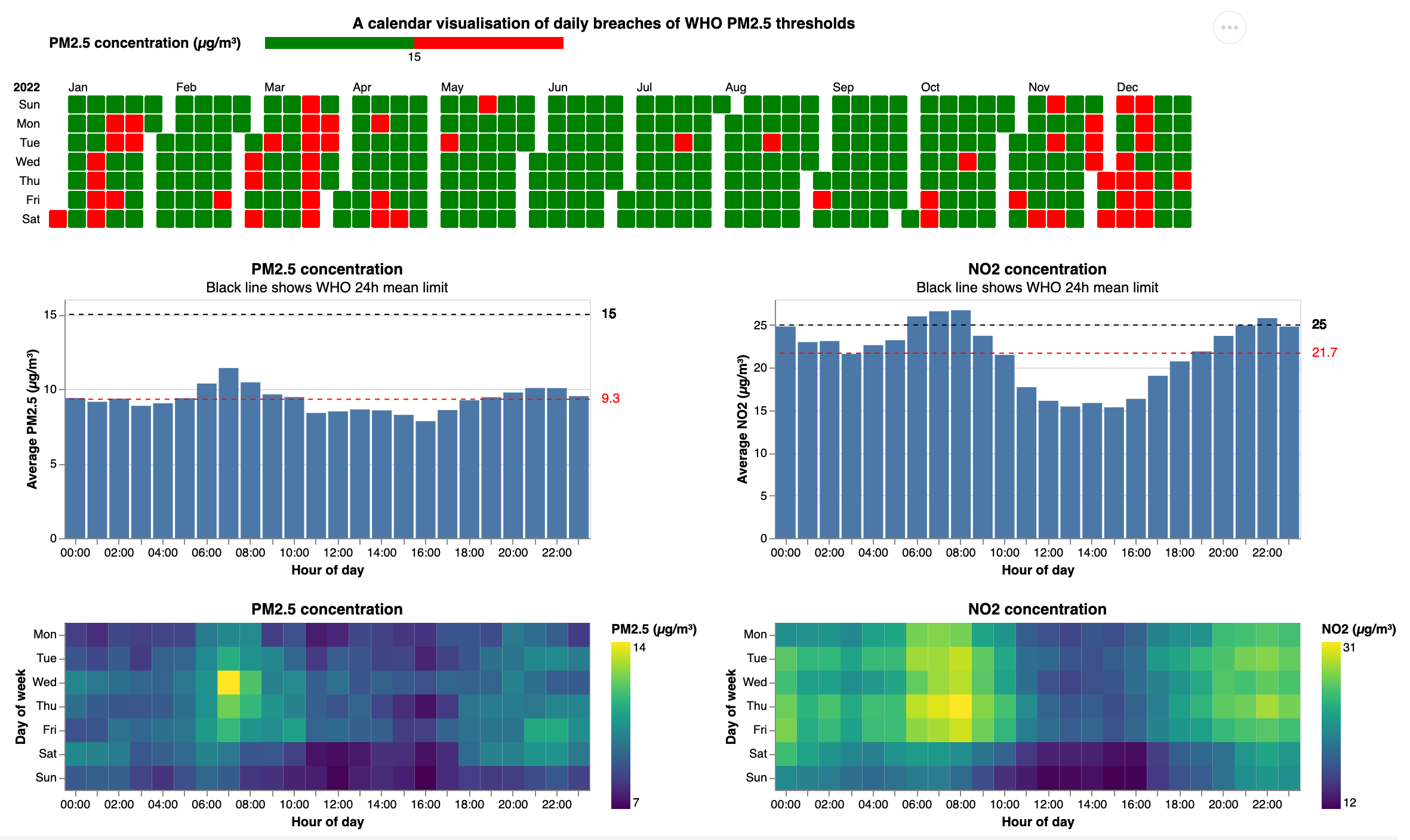
Here are the main visualisations we came up with for PM2.5 and NO2, using an existing Breathe London node chosen at random:
The top calendar view shows days on which the daily average broke the WHO daily limit for PM2.5. Note that we haven’t got the averages actually calculating correctly yet, but the chart gives an idea of how the data will look: the day is green if the average is below the WHO limit of 15µg/m³ and red if it is above. WHO states that it should not be breached more than 3-4 times a year.
The middle bar charts show the average hourly values across all days, along with the WHO 24h mean limit and the actual mean for the day. We found it easier to see if readings were breaching limits, but note that the bars represent hourly readings and the WHO targets 24h means, so for the NO2 example above, the WHO limit wasn't actually breached.
The bottom heatmap breaks this down by day of week. For the NO2 plot you can see morning and evening peaks. It is interesting that the evening peak is later than you might expect. You can also see a big difference between weekday and weekend. The scales still need to be adjusted to connect better to WHO average limits. But this heatmap might help with personal management of day-to-day and hour-to-hour exposure by highlighting when air quality is better.
Speed data-ing
The image above is a static screenshot from an ObservableHQ notebook. Due to the ways data is accessed we can’t make the notebook public yet, but hope to be able to publish a set of interactive charts where people can select different nodes and date ranges and explore the data themselves.
Another chart Sacha is looking at is something to track longer-term change: is the air pollution where I live getting better or worse? For instance, a monthly average chart, where you can see the month-on-month change. It might be necessary to factor in seasonality as well though, if pollution levels vary between summer and winter, for instance.
Hopefully by the time we have the visualisations finalised our node will be installed and we can start sharing some data! If you have any ideas for ways of visualising data or things that would help you to understand air pollution trends better, please let us know by leaving a comment.


