Back to school
Hazy reception
It’s September again, and up and down the country parents are getting their kids ready for the first day of school and posting obligatory photos of their DD or DS* on social media. And with it brings changes in transport habits as families return to the term time commutes. In the 2022 National Travel Survey, 40% of children aged 5-10 travel to school by car, while in a bizarre catch-22, the 2022 Living Streets Survey finds that traffic is one of the biggest barriers to children walking to school, with 15% parents naming it as a reason their child doesn’t walk. More on this later, but first an investigation on using differential background data as a way to highlight changes in air pollution.
The background is relatively interesting
An LTN gets put in place: how has this affected air quality? Or more topically, how has the ULEZ expansion changed things? Answering questions like this require some care: differences from one day to the next might be due to weather conditions, daily variations or even seasonal variations. Comparing year-on-year data (eg, comparing this June to last June) will remove seasonality, but very often you don’t have years worth of data to analyse.
One technique that can be used is to compare a particular dataset to background levels. For instance, by comparing a node of interest to the average levels of several nearby nodes, you might be able to highlight the effects of an intervention on that one particular node.
Keen to see if we could get this to work, we quizzed our Breathe London community for possible examples. One member mentioned that roadworks were in place by the node at the St Luke’s Hospice, and there was a lot of stationary traffic queuing, or when moving, were going very slowly. We wanted to see if the differential technique could highlight any impact.
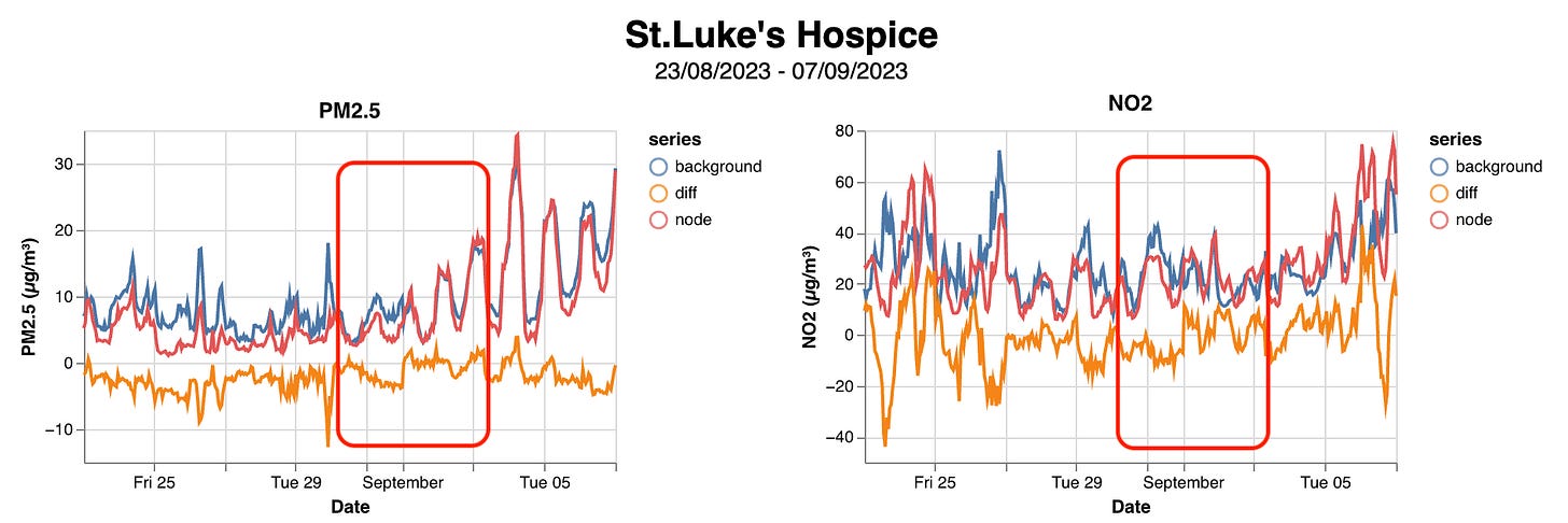
We calculated the average of the three nearby nodes shown in green below and compared it to the St Luke’s node.
The orange line in the charts below shows the difference between the background average and the St Luke’s node, and the red box shows the time when the temporary traffic lights were in place. In this case there doesn’t look like there is much impact on the measured air quality from the roadworks. However, we did notice that the pattern of PM2.5 and NO2 readings changes considerably from the start of September, and this takes us back to the opening paragraph.
That’s us schooled
We decided to look at another Lambeth node, at Stockwell Primary to see if we could see any similar patterns, and indeed we could. School starts at Stockwell on 4 September, and the charts below show the PM2.5 and NO2 levels from two weeks before and the week after (this week). Again, there’s a marked change in the pattern of PM2.5 readings with more and more breaches of the WHO daily threshold, but interestingly this starts happening the day before term starts.
We’re not sure quite what we can infer from this data, but we will refer it to the expert team from Imperial College who support the Breathe London network and will let you know.
We’re working on some better tools to be able to do background comparisons more easily and hope to demo them over the next couple of weeks.
*Darling Daughter or Son. No, we didn’t know this either before we started trawling Mumsnet for parent chat.


